
Correction — July 28, 2026: This article now distinguishes net domestic-migration gain from percentage population growth, describes IRS income as average adjusted gross income per tax return, and corrects the Maricopa origin-lean comparison from six points to about ten. It also removes causal claims the aggregate migration data cannot establish.
Collin County, Texas, on the northern edge of the Dallas–Fort Worth exurbs, posted the country's largest net domestic-migration gain in the latest county estimates: more than twenty-four thousand people in a year. That is a count of net domestic movers, not a claim that Collin had the fastest percentage population growth. Behind it came Montgomery County north of Houston, Pinal County between Phoenix and Tucson, and Polk County in the Florida interior. Los Angeles County posted a net domestic-migration loss of more than a hundred thousand people, followed by Miami-Dade, Dallas, and Harris. These are prominent examples of losses in large urban counties and gains on parts of the exurban rim; they do not by themselves establish a universal national rule.
None of this is visible on an election-night map. Migration is a slow current beneath the returns, and Akashic now measures it on every county page and ranks it nationally on Explore. The measurement draws on two federal counts that have tracked American movement for decades: the Census Bureau's Population Estimates, which report net domestic migration for every county every year, and the IRS Statistics of Income file, which follows address changes on tax returns to reconstruct who moved from which county to which — and how much income they carried. Neither records a single vote. That limit is the whole discipline of reading them.

What migration is not
It is tempting to draw a straight line from movement to outcome: people leave a blue state, arrive in a red one, and turn it purple. The data does not support the straight line, in either direction, and the honest version is more interesting than the myth.
Start with what the numbers can and cannot say. The IRS file tells us that arrivals in a county came, in aggregate, from places that lean a certain way — because we already know how every origin county votes. It does not tell us how those arrivals themselves vote. A person who leaves a Democratic county is not a Democrat any more than a person who leaves a coastal county is coastal. Migration is one input to a county's political trajectory, alongside three others that leave no forwarding address: residents changing their minds, one generation replacing another, and the same people turning out at different rates. Attributing a county's shift to its newcomers is a guess dressed as a finding. What the data supports is narrower and firmer — a description of the places people are moving between.
Maricopa, slowing to a stop
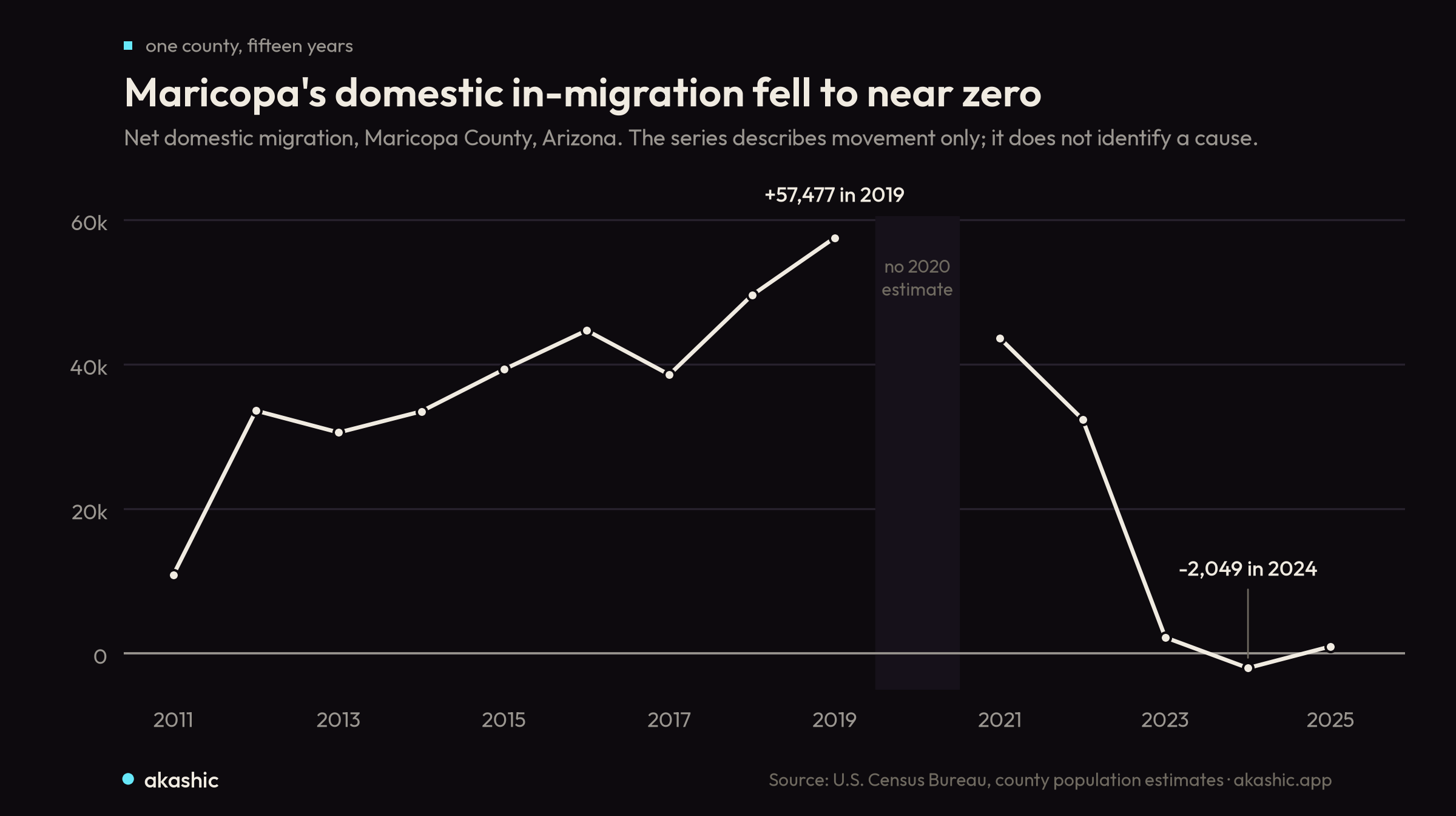
Consider Maricopa County, Arizona — Phoenix and its suburbs, the state's largest county and central to its close 2020 and 2024 presidential results. Maricopa took in a net of fifty-seven thousand domestic movers in 2019. Net domestic migration then slowed to about two thousand in 2023, went slightly negative in 2024, and barely recovered in 2025. The series shows domestic migration falling to near zero; it does not by itself identify housing costs as the cause or say that the county stopped growing by every component.
The arrivals that did come carried a signature. Tax returns associated with movers into Maricopa reported about $88,600 in average adjusted gross income per return, against $103,200 for non-migrant returns — a comparison of tax-return AGI, not household or individual income. The origin counties of Maricopa's arrivals leaned D+6.3 on a mover-weighted basis, while Maricopa itself voted R+3.5: about 9.8 points more Democratic, with substantial inflows from Los Angeles, San Diego, and other California counties. That is not evidence that California voters turned Maricopa blue. It shows that the county's in-migration came, in aggregate, from bluer places than the receiving county.
The churn cuts both ways
Rank every county by the gap between the lean of its arrivals and its own vote, and two mirror-image lists appear.
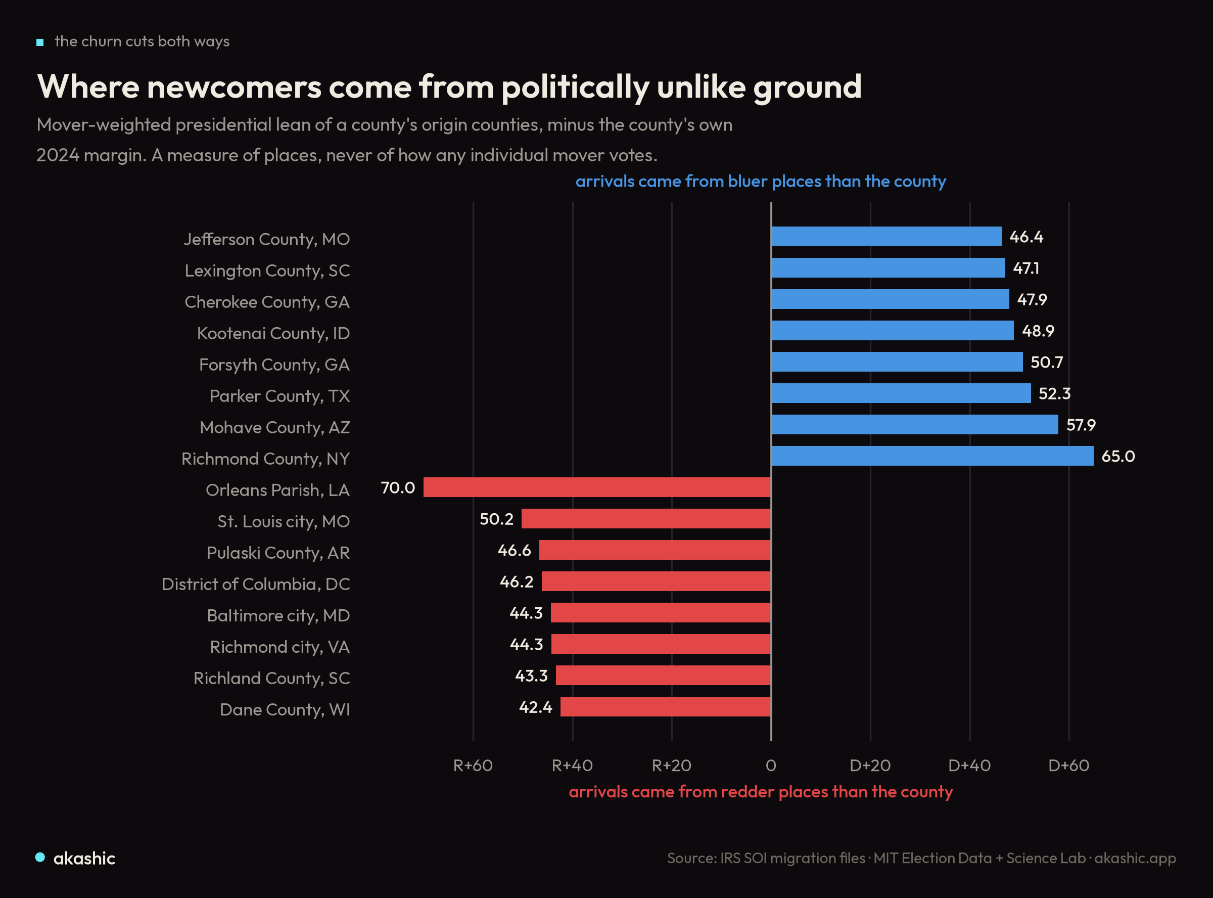
On one side are red exurbs drawing people from bluer places. Kootenai County, Idaho — Coeur d'Alene, the destination of a decade of well-documented departures from the West Coast — sits near the top, its arrivals leaning nearly fifty points more Democratic than the deep-red county receiving them. Forsyth and Cherokee counties on Atlanta's northern edge, Parker County west of Fort Worth, and Mohave County in Arizona's northwest corner tell the same story: conservative growth counties absorbing newcomers from more liberal origins.
On the other side are blue cities drawing people from redder surroundings. Orleans Parish, the District of Columbia, Baltimore, and Dane County, Wisconsin — Madison — all take in arrivals who came, on average, from far more Republican places than the cities themselves. The extreme lists therefore run both ways: some red exurbs draw from bluer origins, while some blue urban counties draw from redder ones. Establishing which pattern predominates nationally would require a distributional statistic beyond these examples.
Whether that churn changes an election depends on things migration data cannot see — how newcomers actually vote, whether they register and turn out, how long they keep the politics of the place they left. What the map shows is the raw material of change, not its result. The full ranking is on Explore, and the net-migration trend and origin network sit on every county page.
Reading the current
The migration panel now runs on all 3,143 counties and rolls up to states, metros, and media markets, drawn from public federal data with no commercial voter file involved. It is built to be read the way the returns themselves should be read on Akashic — as a documentary record, not a prediction. A county gaining people from bluer places is not thereby turning blue. A city drawing people from redder ground is not thereby turning red. The current is real, and it is worth watching precisely because where it leads is not yet written.